News & reviews for the fiction lover in us all!
Size Matters! Part 2 - Fonts!
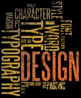
Last month we talked about manuscript size and how the number of words will determine what type of book you have on your hands. Today, we will talk about Typography, or as most people know it, Fonts. We’ll look into the choices you have and what is best used, including the ever-dreaded size. There’s a lot to choose from when we talk about fonts. Heck, just look at a free font website and you’ll see everything from the straight-forward looking to so scripted and hacked that no one can actually read it. From Arial to Wing-Dings, picking the font and size is so important, you need to actually study what you’re doing.
Big vs. Small
Okay, stop giggling at the titles. Fonts have a number of measurements. The first, which most people know, is size, or how large the font appears on the page. The smaller the font, the more it lends itself to pocket books. You know the type, the ones easily put into the back pocket of your pants—hence the name.
However, more and more authors are going for the trade size of 6x9, and thus need a larger font than 8 pt., but it also depends on the font you pick. An 8 pt. in Calibri is different than an 8 pt. in Garamond. If you use your word processor and compare the two together, you’ll see what I mean.
The reasons for going small is the book layout is smaller than a normal trade size. While this is good at keeping the page count down, it runs the gambit of being set aside due to your reader’s inability to read the words. Your target audience has a lot to say on the font size you pick.
Several years ago, we published “The Steam Room Diaries” by Cameron Miller. The success of the book came about because Cameron, a minister, asked us to target his patrons. He mentioned they were a little older than the usual reader, giving us a mean age of 70. To help, we kept the same 6x9 page size, but boosted the font to 12 pt. instead of the usual 10 pt. This made it easier to read and his target audience ate it up.
Romance in a pocket book size lends well to a font size of 8 pt., while some will go as low as 7.5 pt. Don’t be too concerned about using the half measures, it all depends on what your readers need. Virginia Henley loves to use 8.5 pt. in her books, but then again, she has a huge following.
Read the entire article in the July/August 2019 issue of InD'Tale magazine.
You can just click on the magazine image on the left hand side of our home page to open and enjoy!
OR
If you would like to receive the magazine every month (for FREE!) , just sign up on our home page. Once you do, an e-mail validation notice will be sent directly to you. Just open and click the link and you're in - forever! Each month the magazine will be delivered directly to your inbox to downlad and read!


