News & reviews for the fiction lover in us all!


A World Without Professionals
Jimmy
Thomas

A World without Professionals
Can you envision it? Do you even want to? The sick diagnosing themselves... Homeowners attempting to repair electrical failures, figuratively and literally, in the dark... The broken-down motorist left to meddle under the hood without any idea of where, how or what went wrong… Or closer to home - Anyone putting their story ideas to text and self-publishing it?
How would we manage everyday life with uncared-for illnesses? Without common necessities properly functioning? Where would that leave us as a consumer?
The definition of the word or better yet, the title, “Professional” is “Expert and Specialized Knowledge”. Let’s break that down.
“Expert”: meaning 1) someone widely recognized as a reliable source of technique or skill whose faculty for judging or deciding rightly, justly, or wisely is accorded authority and status by their peers or the public in a specific well-distinguished domain. 2) A person with extensive knowledge or ability based on research, experience, or occupation in a particular area of study. 3) Having, involving, or demonstrating great skill, dexterity, or knowledge as the result of experience or training.
Next, “Specialized”: meaning 1) having pursued a special activity, occupation, or field of study. 2) Developed or designed for a special activity or function.
Then, “Knowledge”: meaning 1) the fact or condition of knowing something with familiarity gained through studies, investigation, training or experience. 2) Skills acquired through experience or education. 3) Surpassing the usual; distinct among others of a kind.
Lastly, the two words together, “Specialized Knowledge”, meaning 1) an advanced level of knowledge or expertise in the field. 2) More than simply skilled or familiar with the field. 3) Knowledge beyond the ordinary and not commonplace within the industry.
So, needless to say, I think we can all agree that you would want to hire a “Professional” over a novice, amateur, or someone fiddling in the field you are in need of services from.
Which means you wouldn’t have a plumber do your taxes, a cashier build your house, or a cheerleader quarterback your football team. You wouldn’t have your cable TV installer edit your manuscript, or your landscaper pitch it to publishers.
So would you design and make your daughter’s wedding dress? How about the foundation elements to your friend’s high-rise building? Would you take on the duties of writing up a peace treaty between countries on the brink of nuclear war? How about offering to develop a strategic mission for a few dozen highly-trained soldiers to invade and capture a known terrorist? Or would you swiftly and confidently decline, and knowing that “Professionals” in those fields should be handling those tasks, duties and jobs, as they are extremely important to the success of each and every one of them?
So, why are “authors” so hastily taking on the role of a “Professional Cover Artist”? Is the sale outcome of your novel not important? Are your writing talents not worthy of quality representation? Are you really content with minimum recognition, exposure and visibility?
Do you know why “Professional” cover artists are better at their craft than authors are? Let me rephrase that since it was really a rhetorical question. Do you know which colors represent which moods, feelings and words best? Do you know which fonts match which genres best? Do you know what makes an image on another image not look superimposed? Do you know how to match the lighting on an outdoor background image with an image of people applied on top of it that was shot indoors? Did you even think to consider that to begin with? Do you know where, and how much, you should crop into an image and why?
If you can’t answer yes to all or most of those questions, then you have no business designing the product packaging for your consumer product (this is a TEENSY bit too strongly worded - is he trying to recruit business or give people shit?); the cover of your novel, at least if you want it to reach more consumers.
Sit back and allow me to tell you a few short stories to show many of you that what you think you may know is really what you don’t know…
Story #1
Knowing Where to Crop Makes All the Difference
Besides shooting random romance novel genre images for my stock image website RomanceNovelCovers.com, I also take “Custom Cover Image Shoot” orders (for a price and all explained on the website’s home page). After the shoot is finished, I select the best 5-20 images to send the client/purchaser for them to choose the one image they want for their novel cover. However, I don’t send them raw, unedited, non-cropped images. I first go through each of them with my “Professional” eye and clean unwanted shadows, blemishes, skin creases in necks and sides from forced turns, wrinkles in clothing or stray hairs. Any items/areas that stand out, I make blend in. These are things the laymen, or most people, don’t have the training and experience (“Specialized Knowledge”) to notice and properly correct in order to make an image look better and more pleasing to the eye.
Once the images are cleaned and edited, they need to be cropped. This is done to balance the image as a whole, to rid the negative, dead spaces, to eliminate unnecessary and attention-drawing items that most would never consider getting rid of, because their “unprofessional” eye in this field is seeing what the conscious sees, while it’s the subconscious that sells the image to the viewer. The subconscious needs to be catered to and pampered, to in-turn, be stimulated.
When author Kathleen Kirkwood, aka Anita Gordan, known for her 1990’s Viking Series (with Fabio on the cover), wanted to redo her series covers when she got the rights back to them, she hired me to create the images for her 4-book Viking Series. After shooting the first custom cover image set, I sent her many images to choose from for her cover image. She selected two that she loved but had trouble deciding between them, so she bought them both. One was cropped to about the waist and the other to about the knees. She liked how they were done, but she asked if I had the image cropped at the knees in full length; head to toe. I said yes, but that I had cropped it as such for a reason, and I wouldn’t let it be used in full-length. This sounds strange to most reading this I’m sure, but this is where the “Expert”; “Professional Knowledge” comes in. Here is my email to Kathleen/Anita:
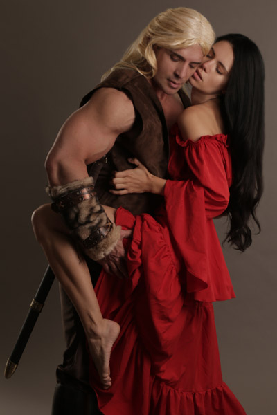
I've attached it for you to see for yourself. Look at the entire image as a whole... even if you look directly at our expressions, your peripheral vision goes to my right boot because it is a big black object in the image.
Now hold your hand over the bottom part that I cropped off and see how your attention only goes to our embrace and passion. This is why I crop my images in advance before uploading them. 99% of viewers; including buyers (authors, publishers and cover artists) don't see or know this. They don't think to look at what the subconscious sees. I'm not saying you are in that 99%, as you have a background in applied art and a degree in art history, I’m just noting what most don't see, which is why I have to crop them so that those who buy my images and just add text to them (which are many), are still getting the best visual focus on the images to be their cover image as is.
So, in conclusion, I would not like you to use the full length of this image please ;) I merely sent it to show you, as my reputation is for putting out quality images, which most don't realize is not just about the passion in the facial expressions and body language, and the lighting we use during our shoots, which gives dramatic appeal to them, but the balance of the image as to how it is cropped, as well as cleaning/editing them just right as for any bright/dark areas/spots, coloring/brightness/contrast adjustments, wrinkles in wardrobe, stray hairs all over heads of hair, messed up hair, bad shadows on faces/under eyes from moving out of our key lights for a second, blemishes, any large freckles or moles that grabs subconscious, visual attention, bra straps accidentally showing, etc., which is why I don't put up full-framed, untouched; raw images with the assumption that everyone buying them will know what is right/best for how to edit, clean and crop them ;)”
Story #2
Stretching the Truth
As I hope you’ve all read in one of my past InD'Tale articles; “The Three Focus Points of Cover Art”, an image is shot for how the object or subject looks. Manipulations should only be of coloring, lightening or darkening, and cropping, with a few minor other design needs, while leaving the truth to the image, the purpose for why it was shot in the first place, to be left as is and not manipulated. Resizing only the width or only the height; squishing the image, usually falls into the restrictions of what you can’t do to a stock image you’ve purchased, and against most licensing rights on stock image websites, as you are destroying the integrity and quality of the image by making it distorted.
Some may not care about that and think it’s a grey area on what is and what isn’t destroying the integrity and quality of an image. However, those people should at least care about what is going to be the face of their novel. A squished image is not only giving the image an incredibly unprofessional look, it’s telling the viewer that the cover was not created by an “Expert” in cover art, that it was not designed by someone “Specialized” in the field, that it was made by someone lacking the “Knowledge” of what makes a cover great or bad; that it was not created by a “Professional”.
I’d tell you this story myself, but the author in my story tells it much better, so I’ll let her words enlighten you, (since she is the “Professional” in that field. ;)
“Stretched to the limit with the job from Hades, I actually had some free time one recent weekend. I thought I’d get my ad for the RNC Convention program ready. Adrift in cyberspace trying to get my book promoted when I have time (which is almost non-existent right now), I recently changed my book cover. Seems the first one I had was rather ambiguous as to the story-line. People weren't sure what the book was about. Alone in the wilderness, or so I thought, I took the picture from the cover and decided to “enhance” it in an effort to “punch it up” a bit.
Well I did just that…managed to give myself a black eye in the process. See I took the amped-up cover and retrofitted so that it would fit in the ad space I’d purchased. Not being a graphic artist (and promising now never to go there again), I ended up distorting the image even more than I already had, but I didn't know any better until after I emailed it to the RNC Convention address.
Lo and behold, Jimmy was the one answering the emails, though when I sent my ad, I didn't know this. So with my ad sent, I go blissfully about my business when out of the blue, a gallon of snow-melt ice water cascaded over my head. Okay, that was figuratively speaking, but it might just as well have happened because it had the same effect. I was brought up short!
Jimmy emailed me and took the time to prod me to think about what I wanted to convey with the ad and what I in fact was conveying. He pointed out, without actually saying how bad it was, that it would be judged against the quality of other ads. He recommended a graphic artist, Erin Dameron-Hill, who he was familiar with and emailed samples of her work. I respectfully asked him to delete the ad I’d submitted. (I mean who in their right mind likes to be hauled off to the principal’s office in front of the whole class.)


Still reeling from shock, I numbly emailed Erin. She quickly replied and within a day, I had a mockup of my new cover and within my financial constraints.
My point is that as independent authors I think we often feel alone in the vast world of self-publishing. I know I seem to be stumbling through the process, while juggling real-life, and for me it’s been quite the learning experience. Thankfully, Jimmy took the time to mentor me at a critical juncture. He certainly didn't have to since he has no monetary stake in the journey of my book, and since I had already purchased his image for my cover.
Instead, I truly believe that he wants each of us to be the best we can. He takes the time to write articles that are a valuable source of information all with the intent to help us realize that our dreams are within reach and that we’re not alone. He’s there to assist and provides the tools necessary to help us succeed. We just have to consider that sometimes it’s better to let the professionals use the tools.
If you do nothing more than read and absorb his missives, you’ll be well on the way. It’s like having your own personal consultant. His nurturing manner and informative articles are all focused on helping us achieve our goals.
I've certainly learned my lesson. I’m a writer not a graphic designer. Don’t skimp on the biggest selling opportunity you have… your cover.
I’ll be forever grateful to Jimmy for taking the time to email me and offer advice and making me realize this is MY dream and I am not alone and neither are you.”
- Sponsored By -
- Sponsored By -