News & reviews for the fiction lover in us all!


Selecting the Final Cover Image
Jimmy
Thomas

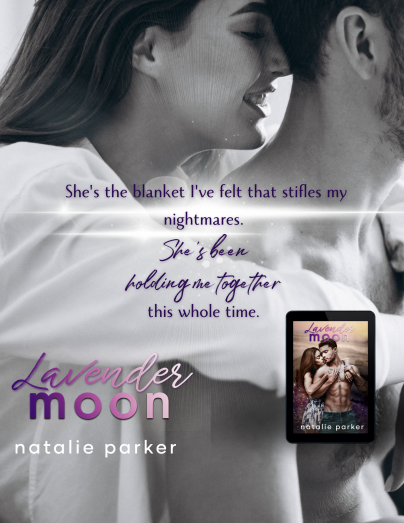
Since the cover is what draws themajority of readers to a book,choosing the right image for your cover is very important. Besides the details in the cover image matching those in the story ( hair color, eye color, ethnicity, genre specific wardrobe, etc.), the overall 'feeling' that image gives is what ultimately propels the viewer to pick up your novel. Since the viewer hasn't read your story yet, they don't know if the image matches the story, therefore, the #1 purpose of a cover image should be to engage the viewer’s emotions. It should make them feel positive, excited, or romantic, whatever is conducive to that story.
As mentioned last month, the colors of a novel cover is what will initially draw a viewer’s eye (and interest) either to it, or away from it. Once the cover has caught the viewer’s attention and they have your novel in sight, the goal is to hold that attention by giving the viewer an emotional connection to your cover image.
From facial expressions to body language, whether sweet and romantic, sexy and hot, or mysterious and intriguing, the viewer HAS to feel something strong from your cover image. Just having one couple in the image, in genre garb, looking at each other, does not stir any feeling in your viewer (unless its
boredom ;)). Whatever is happening in the image HAS to be believable and look like it is/was genuinely happening while someone captured it on film.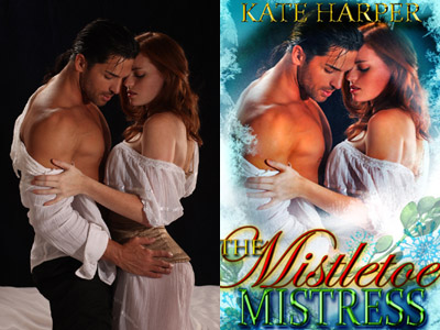
It’s important not to get wowed by a beautiful dress or a great setting in an image when purchasing or creating your cover. A dress or setting is not what
captures the emotions of a reader. They won’t be reading a story about a dress or a setting, they will be reading about people, relationships, experiences, emotions they are discovering and feelings they are dealing with throughout the story. So, readers need to get a taste of what the characters are about, and what they are feeling, just from looking at the cover image.
Besides facial expressions and body language, there are many aspects to images that portray those emotions and make them great, average, or bad. For instance; A hero-type male needs to have proper lighting in order to see muscle definition. This cannot happen with flat lighting straight on him where his entire body is lit up. The model can't be slouching or hunched over, as that minimizes their presence as a MAN, a HERO, and tends to feminizes them. If a female has long hair, it needs to be showing as much as possible.
The models need to be fit and not have limbs like they've never exercised a day in their life, or like they eat whatever they want, and took no thought
about how they look to others by having their unattractive flaws clearly showing. Cover models are not average looking people, if they were you would see your neighbors on them ;) so good appearance is eye-catching.
Getting into the more technical but just as important aspects, are thing such as the position of arms, hands, legs, necks, back-arches and head tilts. These small things are what keep viewer’s attention on the cover. Straight arms are not good. Creating as many triangles as possible, especially with a couple, is most desirable. Triangles keep the subconscious eye following the shape inside the cover, instead of leaving the image right off the cover while following a straight arm, for example.
If you have found the image that fits all the criteria above, now comes your last question...does it match your characters? This is where hair color, build, etc. play their part. Also, is one or two people sufficient or does it need another person or object added to it? Great cover artists can merge different images and will know to match the lighting so that it doesn’t look like multiple images from completely differently shoots. As an example, a good cover artist wouldn't use an image shot indoors with an image shot at the beach, as the lighting on each are completely different; artificial lighting and natural lighting are not the same, they also cause different shadows. Don’t get caught rejecting an image because the hair color or eye color is wrong. That's not a problem, there are many talented cover artists who are great at changing hair and eye color along with a host of over things.
Here are some excellent examples:
From changing clothing colors...
hair and eye color...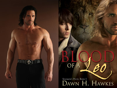
hair length, making someone pregnant...
adding and removing people, tattoos...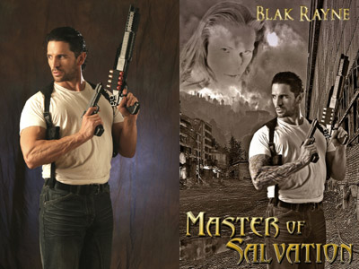
weapons, props, accessories and wings...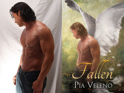
adding a scene that ties into the genre...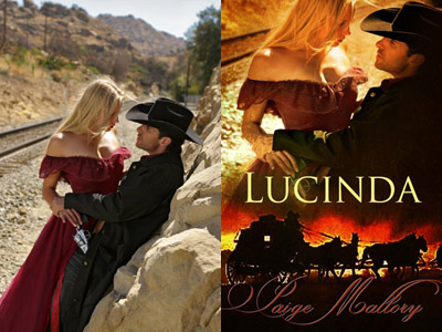
or a background setting...
changing the overall coloring, contrasts, brightness, etc...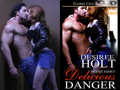
With all the innovative and creative things cover artists can do, you are free to find that striking, passionate, emotionally eye-grabbing image for your cover, without worrying that it doesn't match your story perfectly. And, with a little practice looking for criteria mentioned here, you can have a book that every reader will want to pick up!
Having worked as a personal trainer, writer and architect (where he continues as a part-time consultant), Jimmy has found his niche in the romance novel industry. Gracing the pages of over 3000 (and rising) novel covers, Jimmy now owns and operates the hugely successful stock image website, www.RomanceNovelCovers.com. He is also the founder and owner/operator of the innovative new community website, www.RomanceNovelCenter.com and is currently developing the third of this trifecta, www.RomanceNovelStore.com. Jimmy is also a popular trainer, host, and speaker on branding, marketing, networking and cover art.
- Sponsored By -
- Sponsored By -