News & reviews for the fiction lover in us all!


Cover Design: Three Primary Focus Points
Jimmy
Thomas

1.) Whether you're creating a cover design from a visual in your head, or from an image you feel is perfect to represent your character(s) or story, you have to design the cover around the main image, not create the cover art and then throw the image(s) in and tweak them to fit. Squishing images, especially people, is not only tacky and unprofessional, but it is unappealing, unattractive, amateur-looking and just wrong! Now that Facebook has made profile images square shaped instead of rectangular, how would you like your profile image to be squished in height, but the width to remain the same, making you look short and stout, like a circus mirror would? No, you wouldn't like that? Well, you have to make the picture fit in the square right? You don't have a choice right? There is no possible solution other than to squish it, right?
Ohhhhhh, I see, because it's an image of YOU, you'll choose to pick another image, or crop it, or size the entire image proportionately, but for the cover of the book you want to sell, you are willing to sacrifice the quality, professionalism, tact, respect for the photographer's work and the look/image of the model.

In answer to the question when squishing an image "Will anyone even notice?" YES! They will and they do! And, in most cases, it is also copyright infringement to alter a copyrighted image if doing so is losing the image's integrity, quality and intended look. Altering images by blending them into others, cropping them, altering coloring, brightness, using various altering styles such as paintbrush strokes, are all accepted means of alterations to the stock images you have purchased the licensed rights to, but altering images to ruin their natural appearance is not accepted or allowed. Below is an excerpt from standard stock image website's licensing explanations:
Prohibited Uses
- You may not use or display any content that features a model or person in a manner that depicts such person in a potentially sensitive subject matter, including, but not limited to mental and physical health issues, social issues, sexual or implied sexual activity or preferences, substance abuse, crime, physical or mental abuse or ailments, or any other subject matter that would be reasonably likely to be offensive or unflattering to any person reflected in the content, unless the content itself clearly and undisputedly reflects the model or person in such potentially sensitive subject matter, in which case the content may be used or displayed in a manner that portrays the model or person in the same context and to the same degree depicted in the content itself.
2.) If you are planning to just sell your book as an e-book, think twice about having your cover designed in only an e-book cover format, which is different than for printed book covers. I know many authors who thought they were only going to sell their book in e-book format, so they bought a smaller size image for web-use only in order to save $5.00. They didn't take into account the requirements/necessities for having their book produced in printed format, which are very simple things that can save you the cost of having your entire cover redesigned, in order to have formatted for print. Selling printed versions of a book doesn't cost you anything, but many don't bother going that route because the percentage they earn from printed book sales is far less than from e-book sales. However...
"While e-book reading is markedly growing, printed books still dominate the world of book readers. In a December 2011 survey by Pew, 72% of American adults said they had read a printed book and 11% listened to an audiobook in the previous year, compared with the 17% of adults who had read an e-book."
"2010 ROMStat Report: 80% of romance book purchases were in paperback format in 2010. Not to be ignored, however, is the e-book format, which accounted for 5% in the romance category.”
"Romance Literature Statistics; Readership Statistics:
- One-third of romance book buyers (31%) surveyed currently read e-books, while 69% do not.
- Of those who are not currently reading or buying e-books, a little over half remain quite unlikely to do so any time soon. The top reason (51%) for not reading e-books is that they "prefer the experience of a printed book."
So what they are overlooking is that they are lost to all those readers who only read printed books, don't own an e-reader, or prefer a printed book in their hand. Readers who could spread the word about your book to their friends who do have e-readers and are potential buyers of your book.
With that said, a simple requirement for printed book covers is to leave a quarter of an inch (.25" or 1/4") from all 4 of the book cover's edges, free of any text or important cover art you don't want cut off. That .25" is a safety margin for printers, in case their cutters happen to cut into it. Some printers require a 3/8" safety margin (.375" = 1/8" for cut-off and 1/4" for safety) since the cover is a full bleed (meaning the the cover art goes all the way to the cover edges.)
When a cover is being designed for print, the spine and back cover are taken into account for possibilities such as, having the cover image wrap around the spine and onto the back cover, but since that is a choice, it is not needed to be taken into account when designing an e-book cover. You can always use a solid background on the spine, with the title and image of your book cover on it - which I highly recommend, since books on bookshelves only show the spine as readers are browsing. So, seeing the cover of your book on the spine is going to get far more attention than just words.
3.) The third primary focus on cover design is designing around thumbnail sizes displayed on website bookstores and e-reader devices, not from the enlarged images that appear fully on your monitor. Viewers (potential buyers) are not seeing your enlarged cover image first, and they won't see it at all unless they have a reason to click on the thumbnail image. So, the small thumbnail image needs to show the viewer what is actually on the cover, including a clear visual of the book title and author name. Contrasting colors (light vs. dark) can help with this by separating people from backgrounds, brighter or darker backdrop shadows on text may enhance the legibility of the title and author name, especially when the font itself is close to the background color in darkness or brightness.
Always check your cover art at thumbnail sizes during your design process, not only when you finish your cover. This may save you from having to start over. You can also see unbalanced text, shapes, people, etc., much better when you size images down. Sizing your cover down to 200 x 300 pixels can help you check composition, balance, contrasting colors and distinguished separation of foreground images to background images.

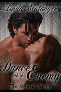

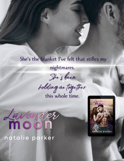
This is why you see authors names so big on covers. It's not an arrogance thing, it is so you will see their name on the book cover at thumbnail size. Notice how quickly and easily you can see, not only the cover art, but also the book titles and author names on the smallest sized thumbnail cover images below, even when converted to black & white, like on e-readers...


The following are thumbnail image sizes displayed on various online bookstores where your novels are posted for sale and advertised...
133 x 200 - Romance Novel Center - thumbnail

111 x 166 - Barnes And Noble - thumbnail
107 x 160 - Amazon - thumbnail
100 x 150 - All Romance Ebooks - thumbnail
71 x 107 - Smashwords - thumbnail
50 x 75 - Goodreads - thumbnail
50 x 75 - Kindle - thumbnail (black & white)
Remember, it's your cover design that has viewers/shoppers either clicking on your book cover to see it larger and read about it, or their eyes passing right by it because it didn't grab their attention among so many other covers that did.
Having worked most of his adult life as an architect, personal trainer, model and multi-business owner, Jimmy Thomas has found his niche in the romance novel industry. Gracing the pages of over 3800 novel covers (and rising), Jimmy now owns and operates the hugely successful stock image website, www.RomanceNovelCovers.com. He is also the founder and owner/operator of the innovative networking, social media website specific to the romance novel industry, www.RomanceNovelCenter.com and is currently developing the third, forth and fifth of his RNC empire. Due to Jimmy's success, he is also a much desired speaker and presenter on branding, marketing, networking and cover art.
- Sponsored By -

- Sponsored By -